Market Outlook: Long Term Returns are Driven by Valuations | Second Quarter 2018
by: Smith and Howard Wealth Management

In a Nutshell:
Broad U.S. markets remain relatively expensive. Bond valuations and future expectations have improved marginally as yields have crept higher.
Equities compared to bonds, are somewhat expensive, but at a level which still indicates they can outperform bonds over a full business or market cycle. Long-term returns on both are still expected to be positive, but perhaps lower than historical averages. Diversification away from traditional U.S. assets and strategies remains a key component to our strategy, as both represent avenues to diversify risks and generate additional return.
For an in-depth look at the big picture, read below.
The Big Picture
The big picture for Smith and Howard Wealth Management is always going to be framed by valuations (see our previous article “Why Valuation Matters”). As long-term investors, we recognize that while it is interesting to speculate and debate about near-term events and breaking news, ultimately, investment returns are driven by valuations. Shifting portfolios towards cheap assets and away from expensive ones “wins” over time. It not only generates a higher long-term return, but typically results in smaller drawdowns or losses along the way. Put more simply, it’s the amazingly simple, but difficult to execute philosophy of “buy low, sell high.”
Bond Outlook Improves Again
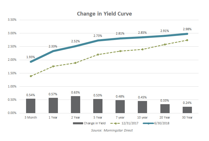
As we detailed in our Deeper Dive section last quarter, the increase in bond yields in the U.S. has many ramifications for investors. One is that it is likely to dampen or even turn negative bond returns for investors as higher yields mean lower bond prices (as it has done this year). A more positive ramification of those higher rates is that bond investors may expect higher future expected returns. Bond yields are still at relatively low levels, but the picture continues to improve for future returns (again, at the expense of current returns). As the accompanying chart (Change in Yield Curve) shows, U.S. Treasury yields have increased for all maturities, although the move has been more pronounced in shorter maturity bonds. With more Fed rate hikes expected this year and next, it is likely we’ll continue to see rates move higher.

The picture in more opportunistic segments of the bond market has not changed markedly and would be characterized as expensive. Credit spreads for corporate bonds remain tight and even though they offer additional yield pickup it is hard to call them a bargain at current valuations.
Equities – Are Investors Being Adequately Compensated for Risk?
Most investors understand that there is a meaningful difference in the amount of risk a stock investor takes as compared to a bond investor. Stock investors understandably expect to receive a higher rate of return, due to the additional risk they take on. From a formulaic standpoint, this is where price matters, as it is a key input helping an investor make a judgement about whether they are being compensated adequately for the added risk. Logically, the higher the price for a stock the lower the “extra” return (and vice versa, of course). In investment lingo this is typically referred to as the equity risk premium.
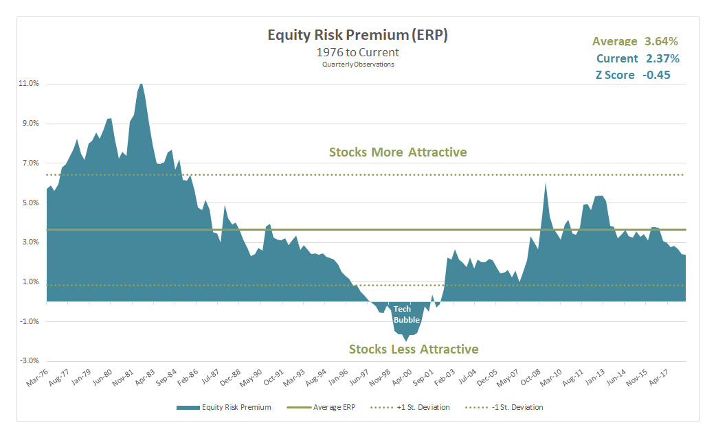
In prior quarters we’ve shown a chart depicting the current real yield levels of stocks and bonds, as well as their historical levels and their relationships at different points in time. It is a great chart for understanding valuations in bonds and stocks from a historical context, but it doesn’t clearly depict the risk premium in equities. To give a better sense of that equity risk premium today and how it is changed over time we isolated that aspect in the chart “Equity Risk Premium (ERP)”.

The shaded area and the corresponding point on the vertical axis show how the equity risk premium has changed over time (date on horizontal axis). Many investors might expect this figure to be rather static (i.e. “I always expect to get 4% more than bonds”), but the graph makes it obvious just how much this changes over time. While we’ve calculated the average over the time period (3.64%) we would not suggest that this or any other figure is the “correct” figure. Rather the value in this chart is more in understanding the overall risk appetite of equity investors. What “premium” or “extra” return are investors expecting or demanding today when they purchase stocks?
The higher the figure, the more the expected reward is for the investor relative to bonds. A reasonable conclusion would be that periods where the risk premium exceeds the solid green average line are good times to buy equities, and readings below are poor. It’s never quite that simple or precise, which is why we’ve included the dotted green lines that represent one standard deviation above and below the average. In layman’s terms one can think of the range of results between the two dotted lines as fairly normal readings. Readings above or below the dotted lines would be considered outliers and more clearly signal that an equity market is unusually cheap or expensive.
If we walk through the graph from left to right we can see how this has actually worked over time. The late 70’s were characterized by very high interest rates and inflation, but also very low stock multiples. Large Cap U.S. stocks were trading for as little as 6 or 7 times normalized earnings and by this analysis were cheap as compared to bonds. The decade of the 80s should have been a strong decade of return for stocks – and it was. From 1980 through 1989 the S&P 500 was +17.6% annualized while the U.S. 10 Year Treasury returned “only” +12.4%. Both are great returns, but obviously an “extra” 5.2% per year adds up!
The other outlier on this chart would be the tech bubble in the late 90s. In the case of the tech bubble, investors were so enamored with equities that they drove the risk premium to be an actual risk discount. Investors were forgoing real bond yields of 5-6% in favor of buying equities at multiples that translated to yields well below that. This is easier to say and see in hindsight, obviously. Investors didn’t consciously make that choice. They were simply convinced that valuation didn’t matter because of the new growth paradigm created by the internet. Unfortunately, we all know how that period played out. From 2000 to 2009 US Large Cap stocks returned -1% annualized while the U.S. 10 Year Treasury returned +6.5%. Investors underpriced the risk in equities and paid for it with significantly lower returns.
The good news is the current reading does still indicate higher returns for equities relative to bonds and sits within the range of premiums we’d consider fair or normal. The bad news is that while we’re not anywhere close to being in a late 90s like tech bubble, the market is still skewed to the more expensive side of history (current reading is 2.37% vs. average of 3.64%). What does all this mean? Nobody, including us, knows what it will mean for near term returns or year by year returns, but it has historically been a great indicator of what investors can expect for the next 7-10 years. Investors can expect stocks to outperform bonds, but perhaps not by as much as they have historically. Taken in combination with low overall bond yields (addressed earlier in this section) it also likely means that equity market returns will fall short of the 10+% returns equity investors have been taught to expect or target.
Diversification Benefits
Our comments on bonds and stocks focuses primarily on U.S. markets at a very high level. Given that high level valuations are still stretched, looking for less expensive “pockets” of opportunity within the U.S. and around the globe takes on greater importance. International equities, both developed and emerging markets, as well as various alternative strategies continue to present good relative value opportunities and/or returns less dependent upon markets continuing to simply go up. That has been and remains core to our strategy. While it is always more comfortable to invest closer to home, we must be willing and able to go where the returns are. To learn more about the benefits of diversification, contact Brad Swinsburg 404-874-6244.
Explore more information on the second quarter of 2018 by visiting these links:
Market Recap: Second Quarter 2018
On the Horizon: Seven Focus Areas
A Deeper Dive: What is the market going to do this year?
Unless stated otherwise, any estimates or projections (including performance and risk) given in this presentation are intended to be forward-looking statements. Such estimates are subject to actual known and unknown risks, uncertainties, and other factors that could cause actual results to differ materially from those projected. The securities described within this presentation do not represent all of the securities purchased, sold or recommended for client accounts. The reader should not assume that an investment in such securities was or will be profitable. Past performance does not indicate future results.

Subscribe to our newsletter to get inside access to timely news, trends and insights from Smith and Howard Wealth Management.