Making money is obviously the end goal for every investor and the longer the timeframe, the greater the likelihood of that occurring. Experienced investors know that markets don’t simply go up in a straight line though, and therefore, even though their long-term expectations may not change, their near-term ones are often forced to. A case in point would be the last two-plus years. With both stocks and bonds falling during 2022, investors’ near-term focus was redirected toward recovering from those losses.
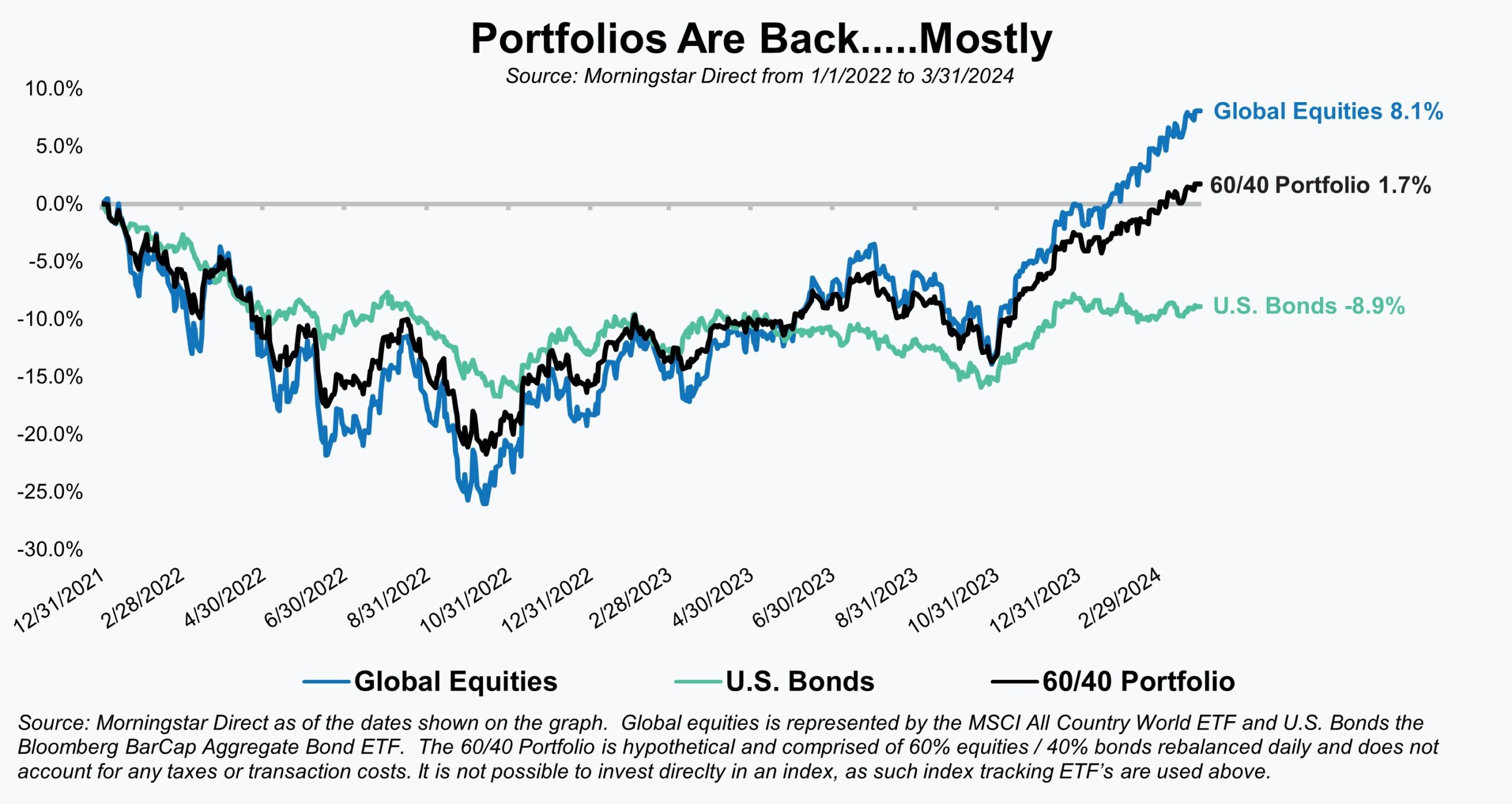
In financial industry lingo, this would be referred to as trying to get back to a “high-water mark”. As a result, it’s something we’ve been closely tracking for clients and portfolios because, of course, one can’t make money until they’ve returned to that prior high point or high-water mark. With the caveat that every investor and portfolio will be different, this past quarter marked the point at which many diversified investors and portfolios, after nearly 27 months, finally approached that level (if not actually exceeded it).
The accompanying illustration is one that we’ve been using with investors for the better part of the past year to track where their portfolio, as well as stock and bond indices, was relative to the start of 2022. With the S&P 500 previously peaking on January 3, 2022, the beginning of that calendar year effectively and conveniently marked the prior high point for most investors. As shown here, a traditional 60/40 portfolio (global equities/taxable U.S. bonds) finally crossed back over that high-water mark this past month.
The path forward from here is bound to be filled with plenty of new twists and turns, but hopefully, with portfolios back to or even exceeding prior highs, investors can finally put 2022 behind them.
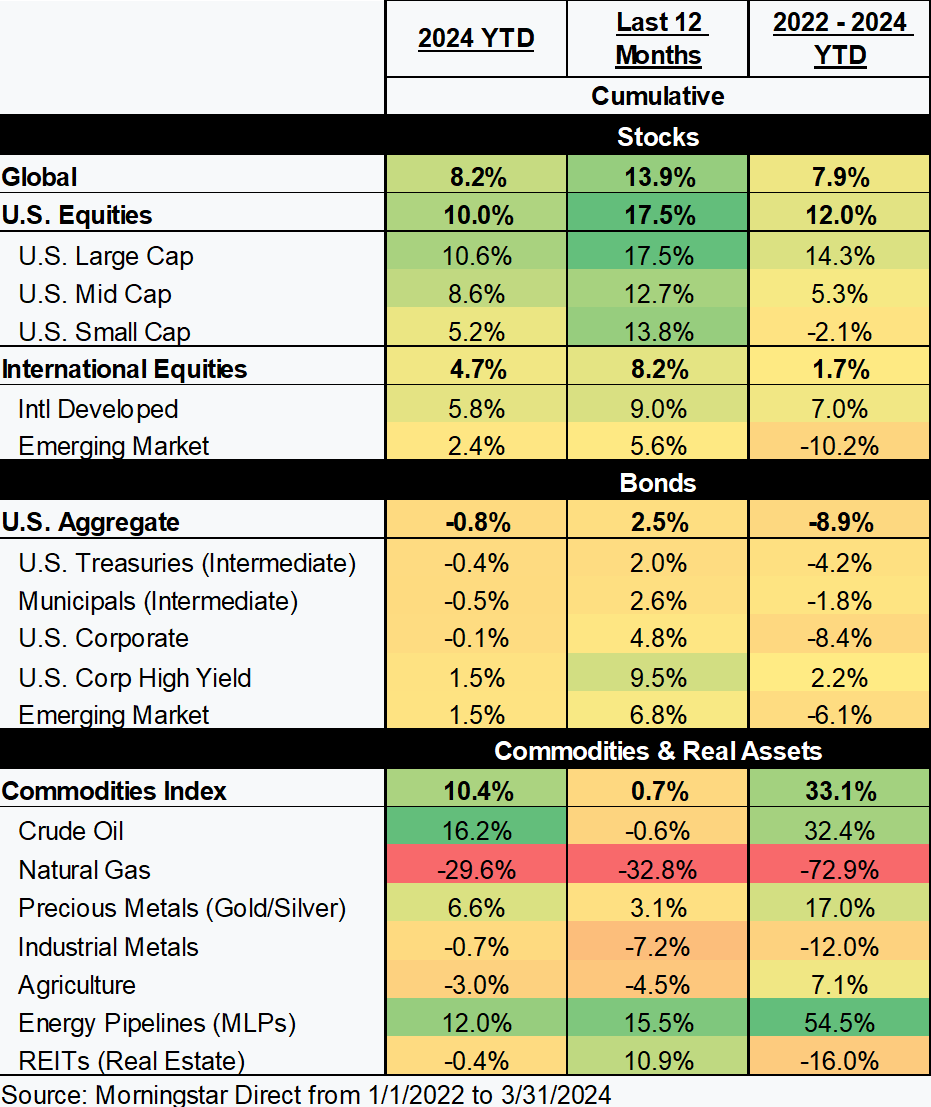
After a downturn, it’s typically the equity-focused portfolios that take longer to recover, but not in this instance. Equities, broadly speaking, have more than recovered, and its bonds this time have slowed the recovery. That divergence certainly impacts our outlook for each asset class going forward, but we’ll touch on that later in our report. As our graph and the following market heat map show, the path of recovery was far from uniform or evenly distributed even within asset classes which means that not every investor is back to their high-water mark.
Equities
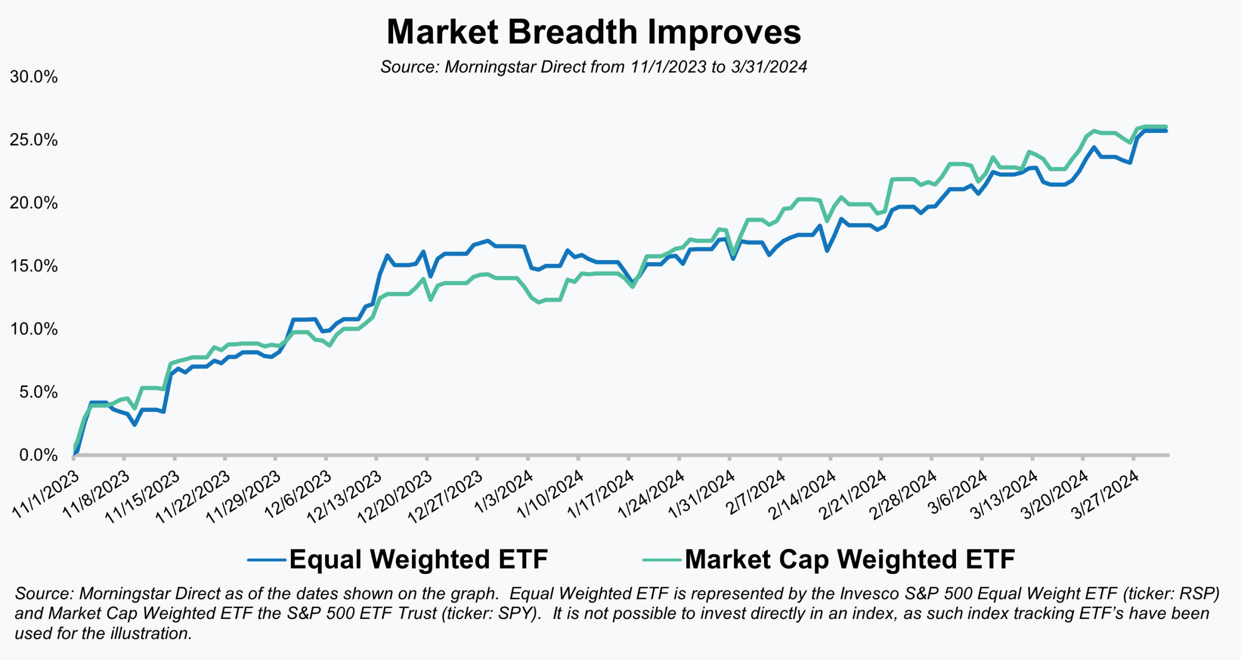
Much has been made of the “Magnificent Seven” stocks over the past year, and for good reason. They make up a large component of not just U.S. markets, but global markets, and they accounted for a disproportionate amount of equity market returns in 2023. That type of market concentration and narrow breadth of returns, however, has historically not been a good harbinger for markets. Fortunately, since the start of the equity rally this past November, we’ve witnessed better “market breadth” (the number of stocks advancing compared to the number declining). The Magnificent Seven are still performing well, but are now not the only stocks producing solid returns. We can see evidence of that greater breadth by comparing a market-cap weighted S&P 500 Index fund (dominated by the Magnificent Seven) with an equal-weighted one (where the Magnificent Seven’s impact is diluted). After diverging for much of last year, those two ETFs have now enjoyed nearly identical returns over the past five months.
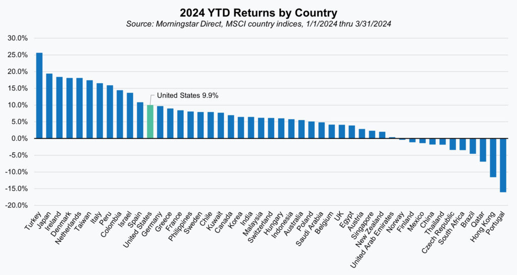
Better market breadth or upside participation hasn’t simply been a U.S. trend though. The S&P 500 may have set 22 new all-time highs so far in 2024, but of the 47 major developed and emerging markets tracked by index provider MSCI, 36 are positive, and 11 have outperformed the U.S., with many of them also setting new all-time highs. An additional detail likely to surprise investors, is that since the start of 2022, the U.S. market ranks only 25th out of those 47 if we look at returns denominated in local currencies.
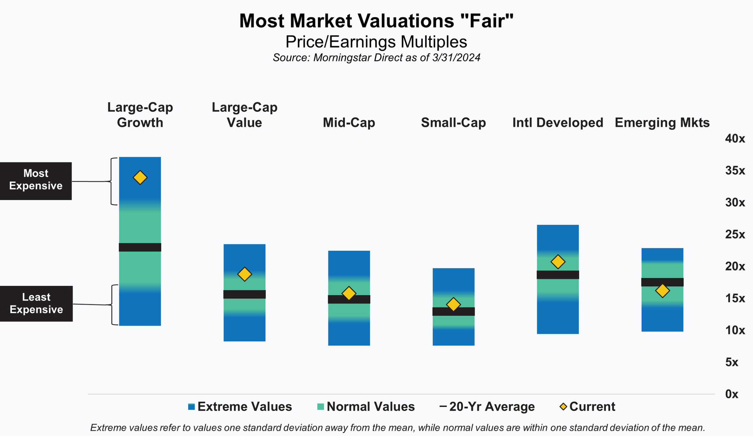
As we’ve said many times, valuations are the best indicator of long-term returns, but not particularly good at predicting returns in the short term. Although that doesn’t mean it can’t be helpful in the short term and we’d like to think that is part of what drove the broader advance in equity markets. With the Magnificent Seven and U.S. large-cap growth stocks in general expensive, we thought (and continue to believe) that the other areas of U.S. and international markets represent fair to attractive value propositions.
Fixed Income
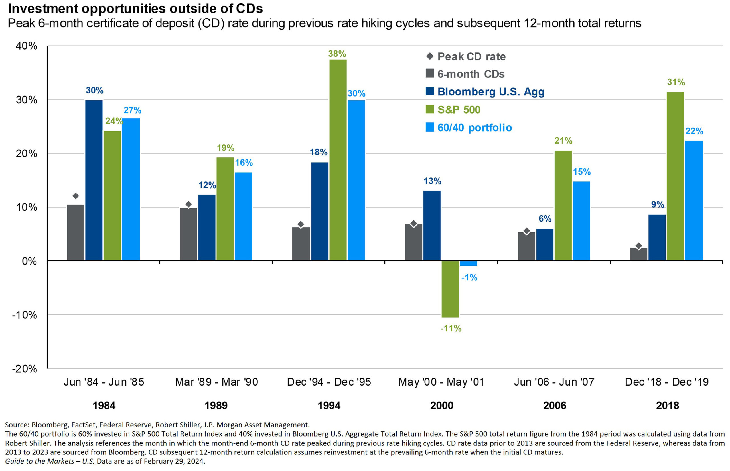
Much of our discussion with fixed income investors continues to focus on cash versus bonds due to the high absolute level of cash yields and the inverted yield curve. Investors understandably are reluctant to forgo the attractive yield on cash to buy a longer-maturity bond with a lower yield. While we understand the reluctance, we thought this chart produced by J.P. Morgan did a good job of showing why investors may be better off in the long run to move from cash into bonds – or even stocks.
This analysis looks back at the past six rate hike cycles and compares the performance of CDs, bonds, stocks, and a 60/40 (stock/bond) portfolio over the twelve-month period after the Fed has stopped hiking rates. We think it’s safe to assume that the Fed is done hiking rates for this cycle since they are now openly talking about the next move(s) being rate cuts. As the illustration shows, over these six periods, bonds outperformed cash in every instance. Cash has been great over the last two years, but we believe investors would be wise not to cling too tightly, for too long to their cash and advise locking in bond yields we generally find attractive.
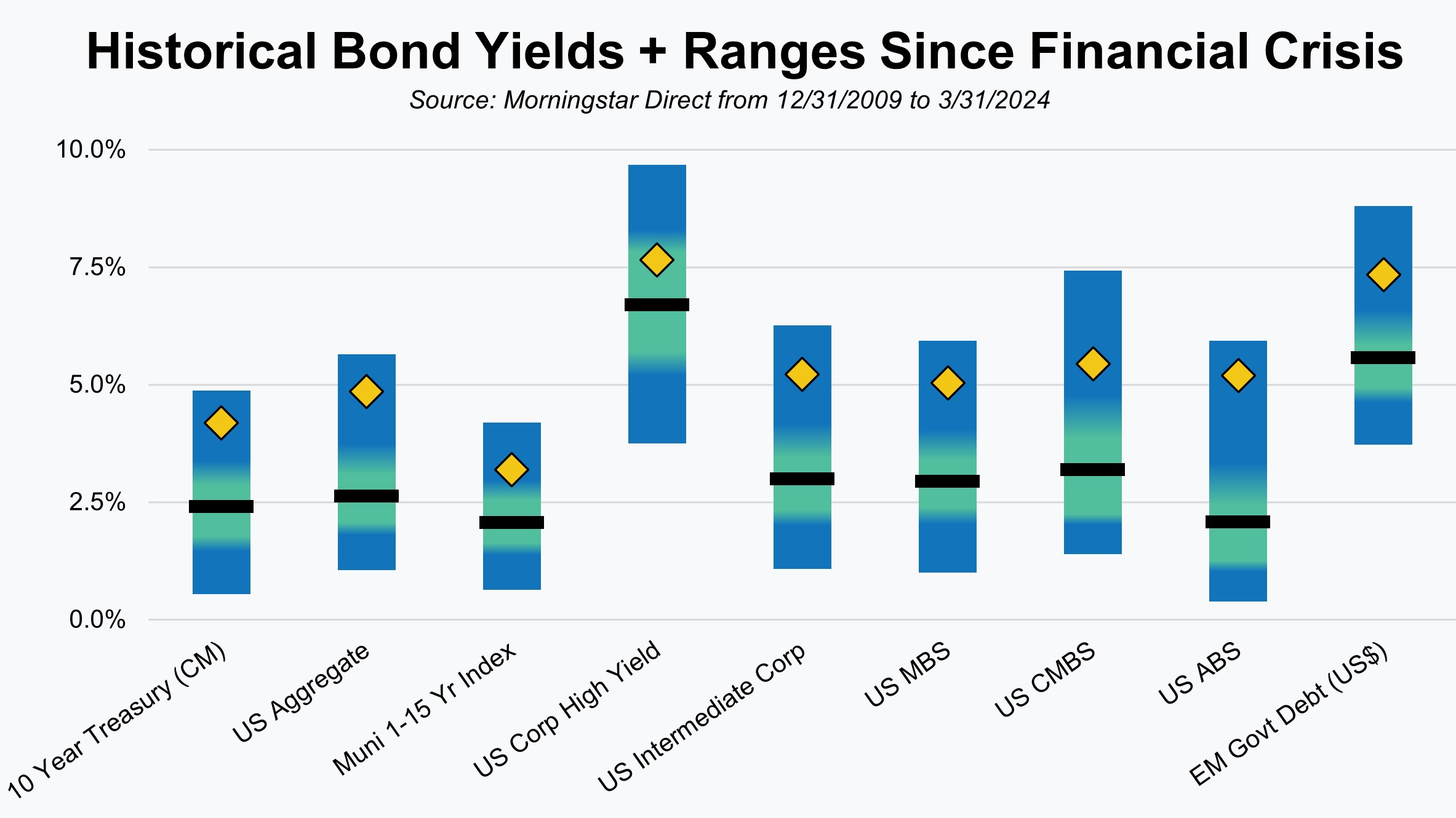
Bond yields are currently about as attractive as they’ve been at any point since the great financial crisis (2008/2009). In our illustration, the current yield is represented by the yellow diamond and the range of yields since the financial crisis represented by the shaded bar. The average is the black line in each of the bars. Current yields across the board are well above that average and are in the upper quartile in nearly every case.
We understand many investors look at bonds today and don’t understand why they’d invest in something that hasn’t generated much return over the last 15 years and has recently performed poorly. Our response is that bond yields and returns are highly correlated, so predictably, low bond yields led to low bond returns. Those yields are now much higher and more attractive. In time, that should lead to returns that are also higher and much more attractive.
Commodities + Real Assets + Alternatives
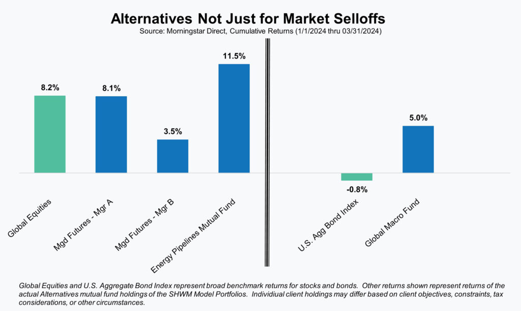
Over the course of the past two years, we’ve highlighted the returns of our various alternative strategies in light of their performance during that period. As pleased as we were by those results, it may have given the false impression that those strategies are only expected to do well during flat or down periods for traditional markets. While that can often be the case, that does not automatically mean they will do poorly during periods of market strength.
There will be times when alternative strategies do well when one or both of those traditional markets also do well. That is what happened this past quarter as equities enjoyed strong performance while our alternative strategies also performed well.
The reasons for the strong performance for the alternative strategies vary, but we thought elements related to the Managed Futures and Energy Pipelines strategies were worth mentioning.
With regard to the Managed Futures strategies, the increase in short-term interest rates has been additive to total returns. Due to their use of futures contracts to take positions, the majority of the funds are able to remain in cash. That cash can be invested and with cash yields currently exceeding 5% it provides a nice boost to fund returns. Total fund returns are still driven primarily by price trends in underlying futures positions, but the cash component currently provides a nice tailwind.
Energy pipelines, and energy in general, have increasingly been mentioned as a beneficiary of the AI (Artificial Intelligence) and cryptocurrency megatrends. Investors finally started to appreciate the massive energy and power generation needs that both require. Many in the tech space had hoped that renewable energy sources could be utilized, but they simply don’t have enough capacity or reliability to provide needed power as AI and cryptocurrency-related power needs continue to grow exponentially. Energy and tech may make for strange bedfellows, but what isn’t surprising to us is that other sectors or areas of the economy besides tech are now starting to benefit from these megatrends.
Unless stated otherwise, any estimates or projections (including performance and risk) given in this presentation are intended to be forward-looking statements. Such estimates are subject to actual known and unknown risks, uncertainties, and other factors that could cause actual results to differ materially from those projected. The securities described within this presentation do not represent all of the securities purchased, sold or recommended for client accounts. The reader should not assume that an investment in such securities was or will be profitable. Past performance does not indicate future results.
Want to get insights right to your inbox?
Subscribe to our newsletter to get inside access to timely news, trends and insights from Smith and Howard Wealth Management.
 April 8, 2024
 Back to Insights